The shadow falls the right way. The roughness is plausible. You matched the key off the chrome ball and the bounce off the grey one, and the thing still looks stuck on.
So you push the lighting. Warm the key a touch, lift the fill, add a rim you know isn’t there. Twenty minutes later it’s closer and worse — you’ve bent a correct lighting setup to compensate for something that was never a lighting problem.
The plate and the render are usually in two different colour worlds, and no amount of moving lights will bring them into one.
What the camera already did to the plate
By the time footage reaches you it has been through a white balance decision, a colour matrix specific to that sensor, and a transfer curve. Possibly a look on top. Those are not neutral operations and they are not the same for two cameras pointed at the same wall.
Your render came out somewhere else entirely: a linear, scene-referred space, lit by an HDRI you or somebody else shot under whatever the panorama head was set to that morning. Two pictures of the same light, described in two different languages.
Matching them by eye at the end is where the shot goes wrong. You grade the CG until it sits, the supervisor changes the shot’s look next week, and every element you hand-tuned drifts, because the correction you baked in was compensating for a transform rather than describing one.
Twenty-four squares of cardboard
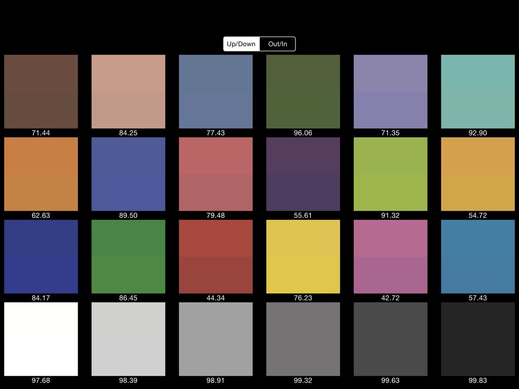
The fix is old and it costs about thirty seconds on set. Somebody holds a colour chart in front of the lens at the head of the take, in the same light the subject is standing in, and the camera records what that known thing looks like through this particular lens, sensor and white balance.
The chart most people mean is the ColorChecker, twenty-four painted patches in a card frame. The paper describing it ran in 1976, and its central design decision lives in the pigments. The patches were formulated so their spectral reflectances mimic natural materials — skin, foliage, flowers — rather than merely matching those colours under one particular light.
That distinction is the whole value of the thing. Two surfaces can look identical under a tungsten lamp and separate violently under an overcast sky if they get there by different spectral routes. A chart made of arbitrary printed swatches would tell you about the swatches. A chart whose patches behave like skin tells you what will happen to skin.
The order that survives a note
Neutral-grade the plate first. Build the transform that takes the photographed chart back to its published reference values, and apply it to the footage. Now the plate is in a known space and you can reason about it.
Correct your HDRI the same way, using the chart shot under that same light. This is the step people skip. An uncorrected panorama carries its own white balance into your render, so your CG is being lit by a slightly different sun than the one that lit the actor.
Then light, render and comp entirely in the neutral space, and put the show’s look on last, over everything at once. When the note comes in — and it always comes in — you change one grade and the CG follows the plate automatically, because they were never separately tuned.
Grey and chrome balls do a different job and you want both. The balls describe the light: direction, hardness, what’s in the environment. The chart describes the camera. Missing either one leaves you guessing at half the problem.
Blender has been the weak link here
Rendering, Blender is genuinely excellent. Plate preparation, less so. AgX replacing Filmic as the default view transform in 4.0 gave it a display pipeline you can defend in front of a colourist, which is a real improvement and a separate question from matching a specific camera on a specific day.
That gap is why a small free extension called CCC Matcher caught my eye this week. Paul Schlichter’s description of it, via BlenderNation, is plain enough: sample a colour checker chart, match the colours of your HDRI and your camera plate. Which is precisely the operation Nuke and Resolve users have had a comfortable button for and Blender users have been doing with a curves node and patience.
I haven’t run it, so take the feature list as the author’s rather than mine.
Even for the small stuff
None of this is only for shows with a data wrangler. If you’re dropping a render into phone footage for a portfolio piece, hold a chart in frame for a second before you start recording. It costs nothing, and it turns the hardest part of the integration from a judgement call into arithmetic.
The version of this I’d argue with is the belief that a good eye replaces it. A good eye is what you spend on the things arithmetic can’t fix — contact shadows, the wrong kind of sharpness, motion that doesn’t have the camera’s weight in it. Spending it on white balance is a waste of the best tool you own.
ColorChecker background from the published description of the chart and its 1976 paper. CCC Matcher was covered by BlenderNation on 31 August 2026; its capabilities are as described by its author.