Reviews for Mortal Shell II went up on 17 August, timed to the premium early access window ahead of the full release on the 20th. Cold Symmetry are asking €49.99, with Playstack publishing.
The consensus, as of today: 86 Top Critic Average on OpenCritic, Mighty tier, 92% of 38 critics recommending. Metacritic sits at 83 overall, 84 on PC and 88 on PS5.
For context, the original Mortal Shell finished on 76. A ten-point jump between a game and its sequel is not a small thing.
Averaging the fifteen outlets I could find a published number for, on a 1-10 scale, gives 8.5 — the full working is at the foot of this piece.
Where the range sits
The interesting part of a spread is its edges, not its middle.
At the top, a cluster of nines: Giant Bomb, Shacknews, COGconnected, GameMAG, Sirus Gaming, Gamers Heroes, The Outerhaven. At the bottom, Console Creatures at 7 — still a recommendation, just a more reserved one. IGN, GameSpot and GamesRadar+ all landed on 8, which is where I would expect a big outlet to sit on something this uncompromising.
Nobody hated it. There is no 5 in this set, which for a soulslike from a studio most people have not heard of is the actual story.
The recurring complaints are consistent enough to take seriously: pacing, difficulty spikes, bugs, and — the word that keeps coming up — opacity. Systems that do not explain themselves, and a game that expects you to work things out.
Hold that word. I want to come back to it.
Around thirty people made this
Cold Symmetry started in 2017 as four people. The original Mortal Shell was made by roughly fifteen. The sequel, by reported accounts, by something close to thirty.
Thirty. Against studios fielding three hundred and scoring in the same band.
I want to be precise about how a team that size competes, because “good art direction” is the answer people give when they do not want to look closely.
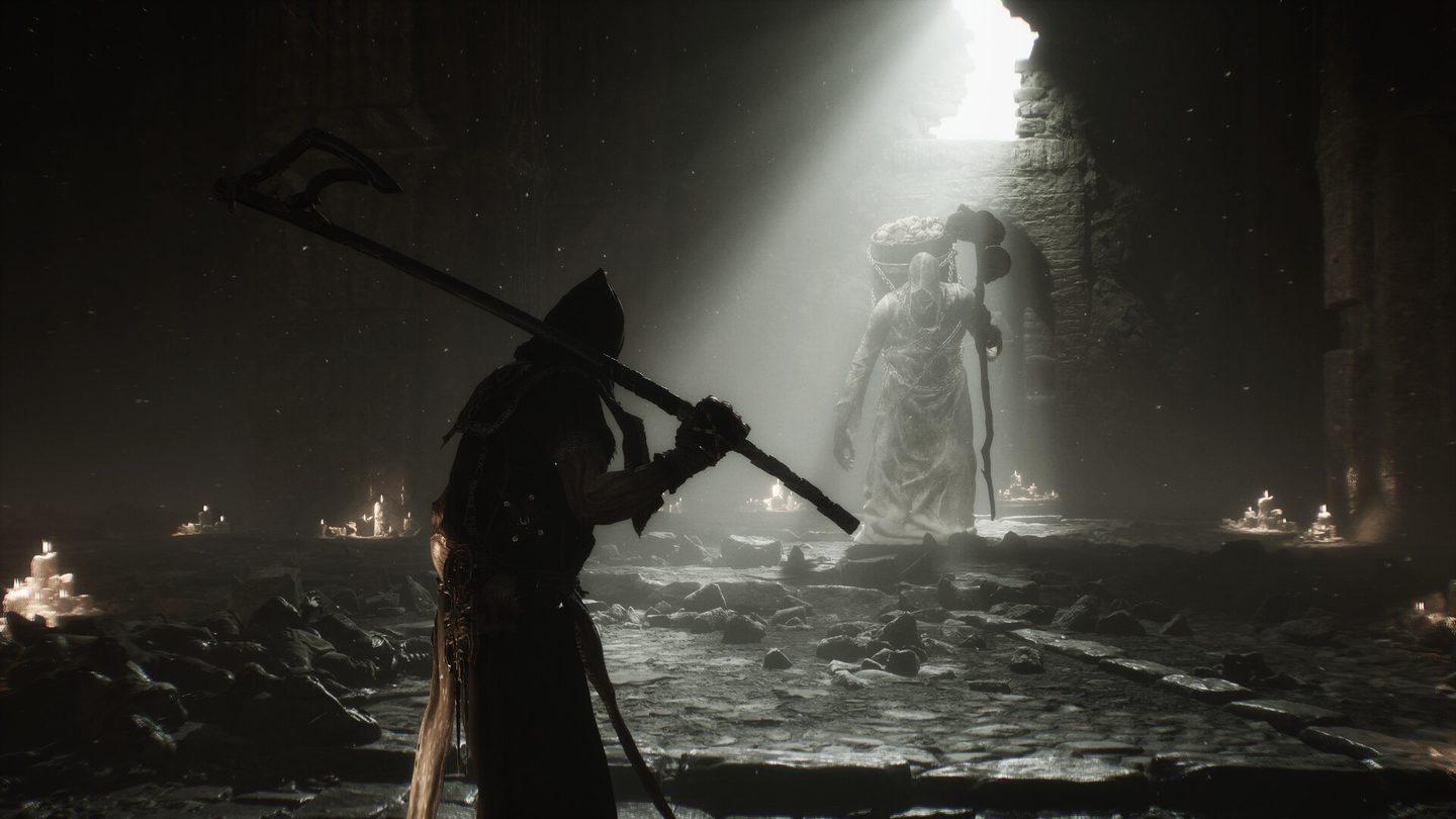
They spend the budget on subtraction. Look at the cover image at the top of this piece: one shaft of daylight through a broken wall, a scatter of candles as practical fills, and everything else falling to near-black. That scene has very few assets in it, arranged so the light does the describing.
Darkness is the cheapest set dressing there is. Every square metre you do not light is a square metre you do not have to model, texture, or populate. The candles are doing double duty — they read as story, and they justify why you can see anything at all.
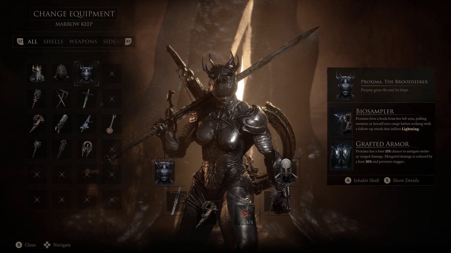
Then they spend everything they saved on materials. The armour in that equipment screen is where the money went: layered metal, cloth with real weight, a specular response that survives being lit by essentially one source. When a game only ever shows you a handful of things clearly, those things have to hold up under a stare.
This is the oldest trick in environment art and it still works, because it is a decision about where attention goes.
The thing that makes it look expensive is the thing reviewers call opaque
Here is where the two halves of this article meet.
The same art direction that lets thirty people compete with three hundred — heavy contrast, information withheld, an environment that does not announce itself — is a readability problem the moment it touches systems. A game lit to hide its edges is also a game where you cannot always see the edge you are supposed to step on.
I do not think that is an accident, and I do not think it is entirely a fault either. Mortal Shell’s identity is refusal. But it does mean the criticism and the compliment are describing the same design decision from opposite sides, and a reviewer marking it down for opacity is not misunderstanding the game so much as declining to forgive it.
That is worth naming, because it is the choice every small team faces. Withhold, and you look more expensive than you are, and some people bounce. Explain, and you need the production budget to fill the room you just lit.
Worth your time?
If you liked the original, this is that with a decade of confidence: an 8.5 average and a ten-point aggregate jump both say the same thing.
If you bounced off the original because it felt obtuse, nothing here suggests they have softened. The complaints are the same complaints. They are just being made about a much better game.
And if you are an artist rather than a player, look at it for the lighting. Not the monsters, not the combat. Count the light sources in any given room and then ask yourself what that room cost.
Aggregate figures as of 17 August 2026 and still moving — Mortal Shell II was reviewed into a premium early access window, and more verdicts will land around the full release on the 20th. The average below is my own arithmetic on the published scores I could verify, not an aggregator’s weighting.